Let me be clear upfront.
The attack on Rooh Afza by Ramdev Baba was disgraceful. Not because it was a competitive jab or marketing gimmick, but because it was a communal dog-whistle wrapped in saffron and bile, targeting a century-old Indian brand purely for its Muslim ownership. That’s not criticism. That’s bigotry. And no amount of asanas will absolve the yogi of that.
So, I stand with Rooh Afza. In a way.
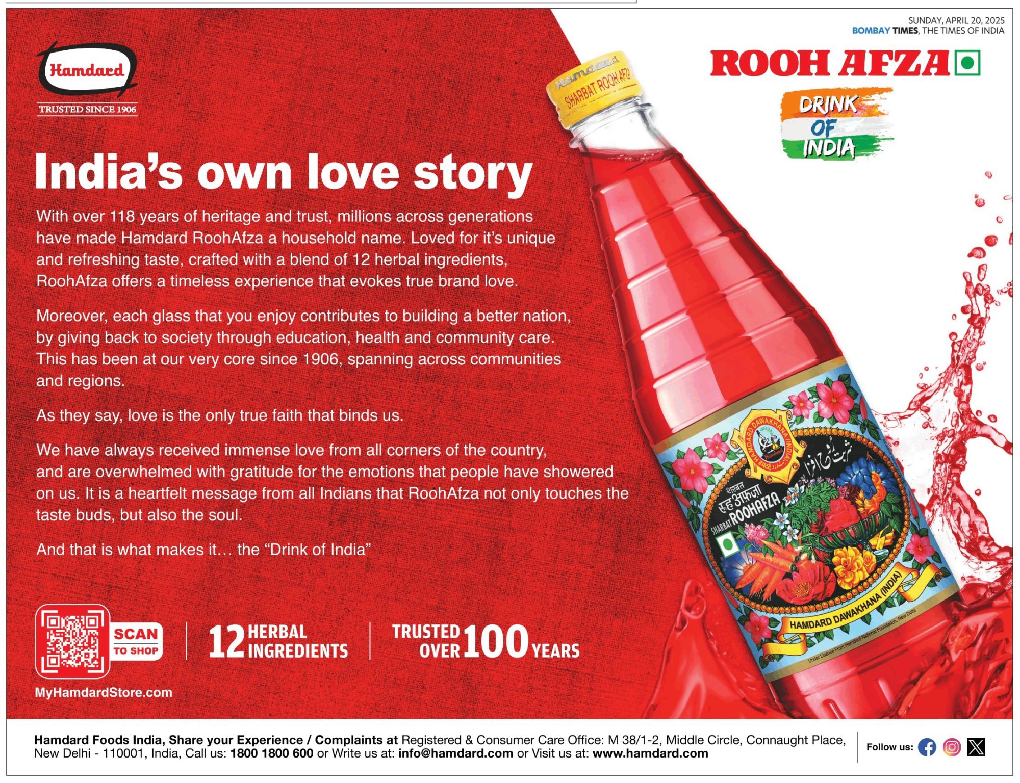
With that out of the way, let me tell you about something that caught my eye recently, something Karthik Srinivasan, whom I deeply respect for his sharp takes on brand communication, touched upon in response to my comments on his LinkedIn post that highlighted Hamdard’s ad. Now, while the brand’s response to the controversy was restrained and dignified, it wasn’t, let’s say, a masterclass in design or language. It had at least one misplaced apostrophe, the design was something that seemed suspiciously as if it were made on Canva, and the general vibe of the ad, with the Indian tricolour, etc., wasn’t something you’d expect from a ₹1,000 crore company.
And that got me thinking.
Because this isn’t just about one ad, or even one brand.
It’s about a larger pattern I’ve noticed for years, one I now believe is not accidental, but brilliant in its own quiet way.
You’ve seen it too, I’m sure. Those ads, labels, emailers, and packaging materials from legacy Indian brands: usually older, often regional, sometimes religious/nationalism-adjacent, and always beloved in specific circles. Something about them is… off.


The fonts are just slightly disoriented. The copy is all over the place and reads like it was translated twice, once by Google, and once by someone’s uncle, and then misprinted. The layout feels like it was done in CorelDRAW in 1998 and never revisited. The colours are too loud, the logo a little too ornamental, the tagline too earnest, too emotional, or too long. The email ids are Gmail. Punctuations are missing or misplaced. The capitalisation is weird. The alignment seems off. And the typos? Oh, they’re everywhere: sometimes right in the headline, a few in the body copy, maybe in the contact details, like confetti tossed in from a parallel dimension where proofreading is an optional ten-mark question.
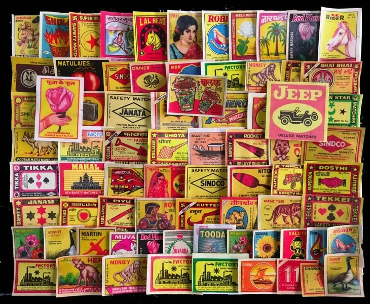
It reminds you of the matchbox covers from back in the late 20th century. Cringe, kitsch, and corniness, all chopped into fine pieces, thrown into a Sumeet Mixie, blended till an inch of their lives, and then poured out onto paper in a manner that is so haphazard that it could replace Lavarand in a pinch.
Indeed, at first glance, it looks like poor execution.
But what if it’s not?
What if the “bad” design is not a bug? What if it is a feature?
Many years ago, I wrote about Nigerian email scams, the infamous 419 messages claiming to be from stranded princes and widowed heiresses offering you a share of their fortune. What fascinated me (I wrote about it later) was the theory behind their obviously poor quality. Why, in a world where you can hire any freelancer for a slick con, would they persist with badly worded, typo-ridden emails?
The answer was elegant: it’s a filter.
If the email looks like a scam, and you still believe it, then you’re exactly the kind of person the scammer wants. The sheer absurdity of the design and language acts as a self-selection tool. It weeds out the sceptics, the questioners, the pedants. And lets through only the most credulous.
Now apply that to Indian brands, particularly those that traffic not in aspiration, but in familiarity.
Take your so-called average urban, design-conscious consumer. The one steeped in millennial minimalism, raised on Scandinavian whitespace, and exposed to global aesthetics through Pinterest, Apple, and Airbnb. Here’s the thing: they are not average. Not by a long shot. They are outliers. Statistically insignificant. A fraction of a percent of the Indian market, if that.
They belong to a very specific socioeconomic bubble that spends more time debating typefaces and the calorific values of product ingredients than bottle size and discounts. They are fluent in the grammar of “clean design”, suspicious of loud colours, and allergic to Comic Sans. But they are not the centre of gravity for Indian branding. If anything, they’re the margin notes.
And that’s the point.
These ads aren’t speaking to them. Not to their wallets. Not to their minds. Not to their cultural references. Because for the vast majority of the Indian population (the people who live outside our Instagrammable lives), the design that feels “too much” to us feels just right to them.
That loud colour? That’s a very Indian way of denoting celebration and joy. That busy layout? That’s value explained properly, without shortcuts or jargon. That typo? That’s a real human behind it. This is a vernacular of design that doesn’t need to be taught or explained. It just is. It belongs where it belongs, and more importantly, to whom it belongs.
In a country where the slickness of branding is often associated with foreignness, elitism, or suspicion, the humble, slightly awkward aesthetic says: this is ours. It is a design language not meant to seduce the cosmopolitan elite but to comfort the culturally rooted. A visual vernacular that doesn’t scream polish because it doesn’t need to.
It is not trying to win Cannes Lions. It’s trying to win your grandmother’s approval.
That syrup bottle with a gaudy label? Your nani used it. That press ad with too much text and too little white space? Your father’s company hired through it. That odd little logo with Urdu, Hindi, and English squished together like the fourth passenger on a three-person bench in a Mumbai local? It’s been on your shelf since before you had shelves.
That’s not laziness. That’s continuity.
The imperfection becomes the proof. The off-ness becomes the authenticity. And the lack of slickness becomes the strategy.
The customer isn’t being manipulated with neuromarketing hacks and split-tested fonts. They’re being spoken to in a dialect of design they understand.
Because to many Indians, “perfect” isn’t trustworthy. It’s suspicious. Too clean. Too sharp. Too foreign. Real life, after all, is messy. Why shouldn’t design be?
This is especially true for brands with cultural, traditional, or community roots. The kind of products you associate with medicine cabinets and mandirs, with Eid and Holi, with your childhood summer drink or your mother’s hair oil. They are not selling efficacy. They are selling emotional shorthand.
Which is why, even when some of these brands are acquired by private equity firms or rebranded by ad agencies, they often retain just enough of the original imperfection to keep their soul intact. A token typo here. A slightly outdated layout there. A nostalgia nudge that says, “We’re still the same. Just better lighting.”
This isn’t to romanticise bad design. Nor is it to suggest that all clumsy branding is secretly brilliant.
But in some cases, especially where tradition, memory, and identity are being sold, aesthetics aren’t about aspiration. They’re about inclusion. And design that excludes the overly critical is a feature, not a flaw.
So, the next time you see an ad or label and wonder, “Who approved this?”, consider the possibility that it was meant to repel you. That its awkwardness is its moat. That its minor mistakes are major markers of belonging.
Because in a world where everyone is trying to look global, the brands that dare to look local, even a little unpolished, aren’t falling behind.
They’re speaking directly to the majority.
Quietly. Confidently. Honestly. And completely in their language.
So, it’s not about you. It never was. And the aesthetics made sure of it.